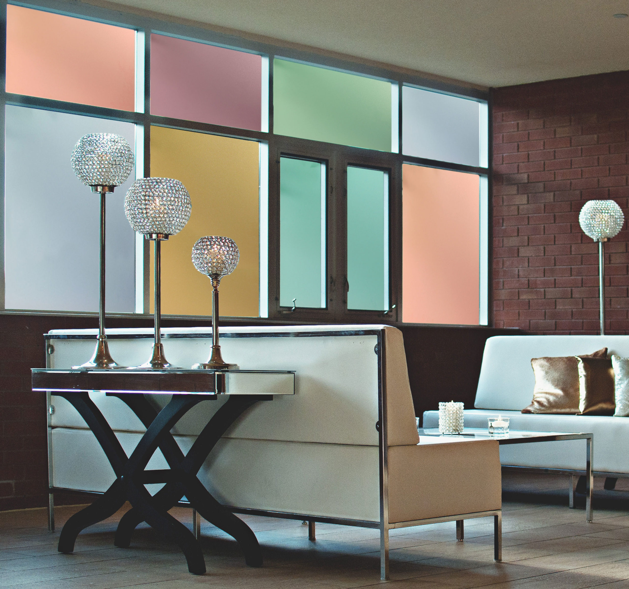
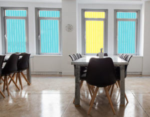
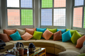
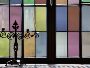
Last time we talked about some of our designs made specifically for large or multiple windows. They include a few variations that work together to avoid too much repetition in your space. If you have a little creative flair and want something truly unique, playing with shapes and colors could be the perfect solution for your next project.
We have several patterns and film types available in a variety of colors. If you’re like me and love playing with color, you can have a lot of fun with these. Mixing different colors of the same pattern or texture can create a contemporary look with your own, unique style.
It can be easy to get overwhelmed when playing with color combinations. Maybe you have no idea where to start. Perhaps your afraid of your space becoming a technicolor nightmare. Here are a few tips to help take the crazy out of your color combos:
-First decide on your base color, the most important color of your design. It doesn’t change, may be used to draw attention, and/or the most dominant color.
-You can start by looking at what you already have in the space, and draw your base color, or even your entire palette, from there. Chances are you already have some kind of color theme going on. If so, just go with the flow.
-If your space has a very neutral color scheme, that’s awesome! It means you get to start with any base color you want.
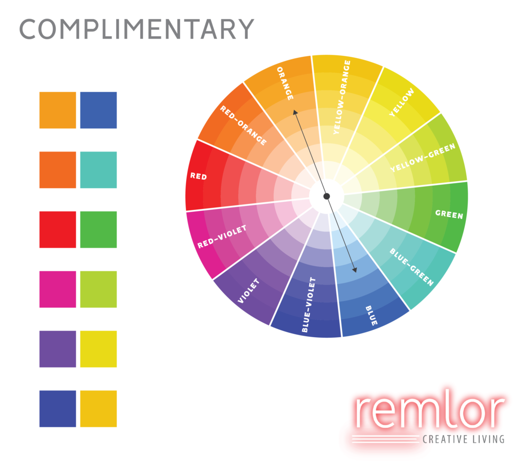
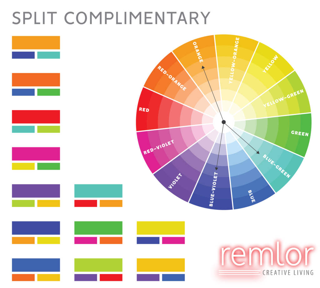
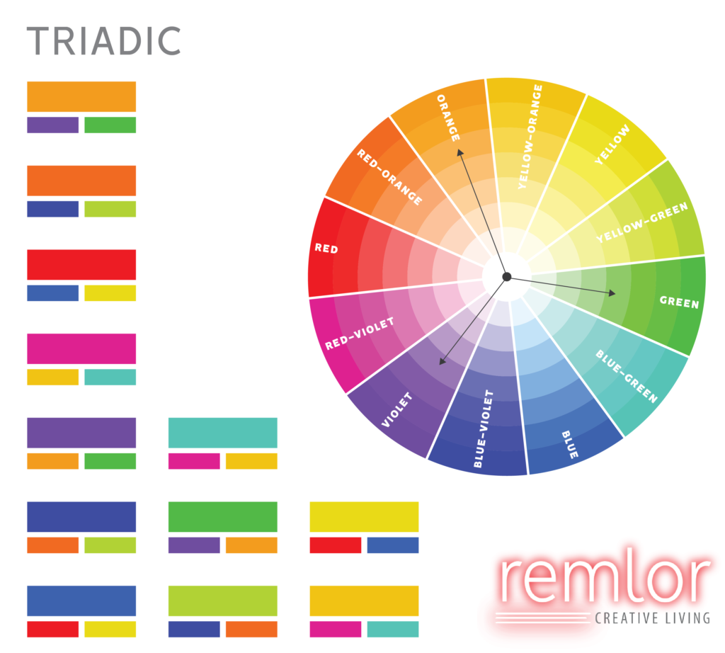
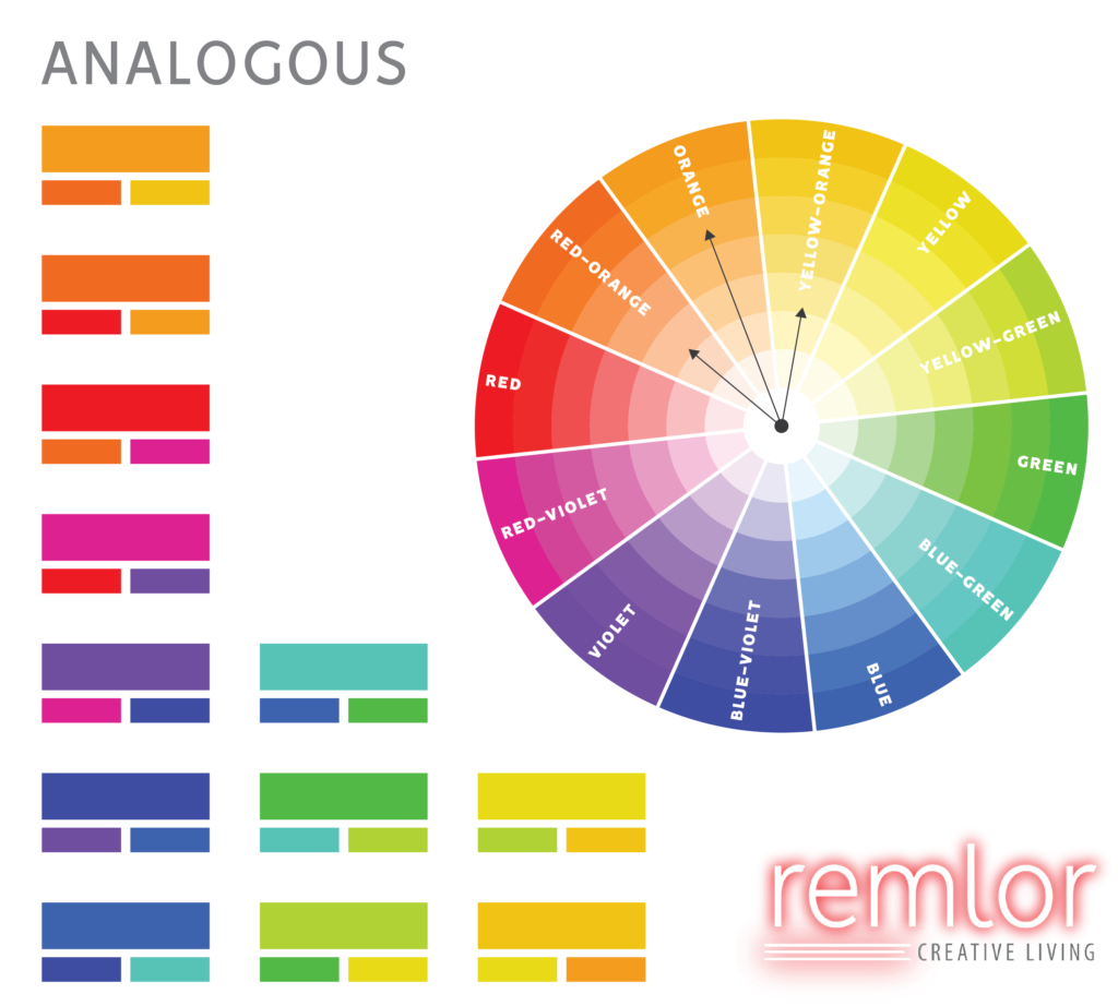
Once you have a base color, it’s time to decide on the rest of your palette. A color wheel can help a lot with this. The images below show a basic color wheel and examples of different color harmonies. Color harmony is the theory of combining colors in a way that’s harmonious to the eye. These color palettes are traditionally used in art and design. They are created by grouping colors based on their relative positions on the color wheel.

Different Color Harmonies
Okay, you’ve decided on your color harmony. Now your all ready to create your perfect mix, right? Here are a few more helpful hints to keep in mind during your color play:
-If you’re using saturated colors and/or a wide variety of colors, it’s best to stick to one pattern or type of film.
-Sometimes less is more. A few bright pops of color thrown in with neutrals like white or beige lets the color stand out more and avoids color overload.
-If you want to mix patterns or film types, stick to a theme. Combine different geometric patterns, or make them all leaves or flowers.
-You can also stick to one color and mix up the patterns or textures. Mix in some neutrals if you want a little more variation.
Just have fun with it and use your imagination. Remember our frosted, textured, and many of our etched designs come in a variety of colors, so there’s more than shapes to play with. Free samples are available, so you can get your mix just right. You can even contact us to create your own custom film or to work with our designer (that’s me!). Good luck and be sure to share your color creations with us on here or Facebook. Check back soon for more tips and tricks!

